Buy&Ship Order Management — reducing CS burden through research-led IA redesign.
Mixed-method research to diagnose why users couldn't self-serve their order status — and turn those insights into 6 actionable design recommendations.
Key contributions
- Framed the research problem around why users couldn't self-serve order status, driving unnecessary CS contact.
- Conducted mixed-method research through survey and 8–10 usability interviews.
- Identified key information gaps and translated findings into prioritised design recommendations.
- Built hi-fi prototypes in Figma Make to test concepts with users before handoff.
Context & problem
Buy&Ship is a cross-border logistics platform offering Proxy Buying and Shipment services, where ambiguous order status labels consistently drive users to Customer Support instead of letting them self-serve.
The Problem
- Customer Support overwhelmed with order/parcel inquiries.
- Users require multiple steps to locate orders and cannot interpret status, progress, or next steps.
Business Goals
- Reduce CS ticket volume — parcel location, status interpretation, perceived delays.
- Visual progress tracking — intuitive timeline with elaboration.
- Strengthen trust and transparency — predictable, consistent tracking.
Redesign the Order Management interface so users can self-serve their order status — reducing reliance on Customer Support?
Rapid prototyping with Figma Make
I built a hi-fi, clickable prototype in Figma Make covering 12 order states across the Proxy Buying and Shipment flows, populated with realistic order data. What would have taken a few days in a conventional hi-fi build took a few hours — so I could put it in front of real Taiwan and Hong Kong users and gather the feedback and insights that shaped the final design before the status taxonomy was locked with Ops and Engineering.
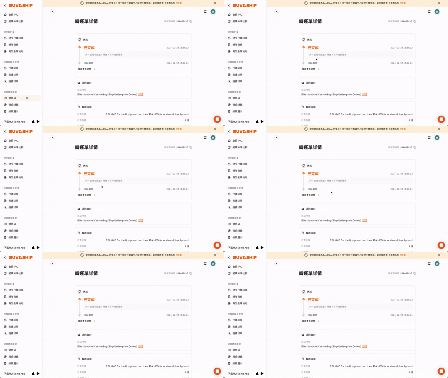
Insight → prototype in Figma Make
Turned prioritised research directions — the tracking timeline, the rewritten status wording — into an interactive hi-fi flow in hours, not days.
Put it in front of users
Ran the prototype in remote TW/HK sessions to collect feedback and insights — watching whether users could self-serve their status without reaching for Customer Support.
Refine, then hand off
Fed observations straight back into the prototype and aligned with Ops and Engineering before handoff.
Research methodology
Objectives
- Evaluate whether new IA improves findability and comprehension.
- Assess whether new UI and status wording reduces confusion.
- Identify information gaps driving unnecessary CS contact.
- Observe learning curve differences across user types.
- Produce prioritised improvement recommendations.
Survey
116 responses from Proxy Buying + Shipping users across Taiwan and Hong Kong, active in the past 3 months.
Baseline + priorityUsability testing & interviews
8–10 participants (new + experienced) from Taiwan and Hong Kong, 30–45 min remote sessions in Mandarin / Cantonese.
Behavioural causesTriangulation
Quantitative scale + qualitative depth, cross-validated into prioritised findings.
PrioritisationKey findings
Shipment shows higher satisfaction than proxy buying, particularly beyond the onboarding stage
- Shipment shows higher satisfaction than proxy buying, particularly during the mid-tenure stages (3–12 months, 1–3 years).
- The onboarding stage (0–3 months) shows the lowest overall satisfaction, rather than the largest gap.
- Among long-term users (3+ years), satisfaction converges as experience compensates for system gaps.
Proxy buying orders lack predictability and ownership clarity
Three pain points surfaced consistently in proxy buying flows — unclear processing timelines, silent failures, and status labels users misread as their own action.
Rewrite status labels to clarify ownership and set time expectationsUnpredictability in processing
Processing times vary (1 day → 2+ weeks) without contextual explanation — users cannot assess if delays are normal.
Lack of closure on failure
No specific failure reasons → users cannot self-correct → repeated mistakes.
Misleading "Purchased" status
Users interpret "Purchased (已購買)" as their own purchase, not the agent's action.
Shipping cost transparency gap
Shipping weight and cost rank in top 3 priorities across ALL user segments. Even 10+ year users lack clear understanding of cross-warehouse fee calculations.
Surface fee calculation logic at every critical touchpointETA is top need; timeline is the best substitute
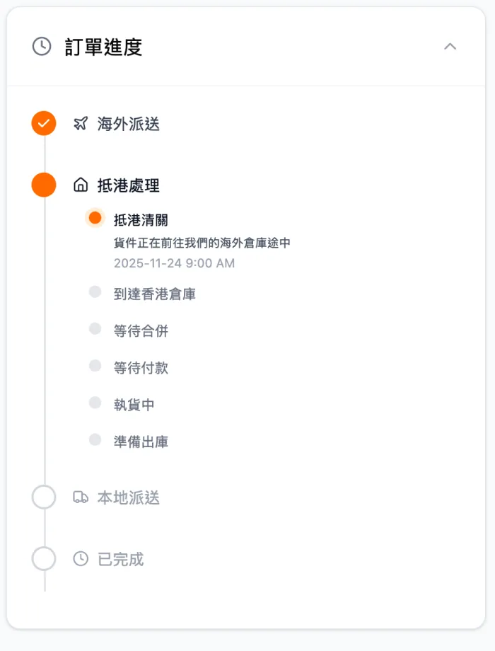
ETA can't be reliably promised due to logistics variability — but the underlying need is certainty, not ETA. Visualising the shipping journey mitigates the fear of the unknown.
Timeline validated as effective ETA substitute — keep and enhanceETA cannot be reliably provided due to logistics variability — the underlying need is certainty, not ETA itself.
Visualising the shipping journey mitigates the fear of the unknown; making progress and expectations visible is the lever.
Design principle & recommendations
When certainty cannot be guaranteed, transparency is the most effective lever.
Six prioritised recommendations, each mapped to the finding it resolves and its expected impact on CS load.
| # | Recommendation | Finding | CS Impact |
|---|---|---|---|
| 01 | Adopt transparency as core strategy — clarity of process, cost, responsibility. | F1, F3, F4 | High |
| 02 | Keep the tracking timeline — primary ETA substitute. | F4 | High |
| 03 | Show completion timestamps — enable self-estimation. | F4 | High |
| 04 | Clarify status meaning and ownership. | F2 | Medium |
| 05 | Expose shipping fee calculation on the order page. | F3 | Medium |
| 06 | Add explicit failure reasons for proxy buying orders. | F2 | Medium |
From research to launch
Status mapping with Operations & PM
AlignmentI worked with Ops and PM to map every backend status to a single user-facing label — Ops covered reality, PM covered priority, research covered misreads. The output: one canonical status taxonomy, shared by design, copy, and engineering.
Inputs to the mapping
- Backend states & transitions — from Operations.
- Business priorities & edge cases — from PM.
- Misread labels & confusion points — from user research.
Output
- One canonical status taxonomy, agreed across functions.
- Clear ownership language — user action vs. system action.
- A mapping doc used as the handoff spec for Engineering.
From research to shipped design
Turning findings into a validated, engineering-ready design involved three distinct checkpoints — each one reducing risk before the next.
What users hit today
Ambiguous status labels and fragmented lists driving CS escalations.
Tested before a line of code
Figma Make hi-fi prototype validated in user interviews.
User testedAligned across Ops, Eng & CS
Status taxonomy signed off by Ops; mapping spec handed to Engineering.
ShippedThe before/after tells the story. A flat, fragmented order list — where a single ambiguous label like "Purchased" (已購買) left users unsure whether they or the buying agent had acted — became a stage-based tracking timeline backed by one canonical status taxonomy that names ownership and the next step at every point.
Each change traces back to a prioritised recommendation: the timeline operationalises transparency and stands in for an ETA that can't be promised (01–02), completion timestamps let users self-estimate (03), rewritten labels resolve the ownership confusion (04), and surfaced fee logic plus explicit failure reasons close the last two gaps (05–06).
Post-launch validation
The shipped listing was A/B-tested against the original with 1,352 survey responses. The honest read: no regression and a mild positive lean — every metric edges the control (satisfaction 4.39 vs 4.31), but none clears statistical significance (p > 0.05), so the rating gains stay directional. What the data does prove is the status change log: 89.9% of users who rated it found it useful (mean 4.54 / 5), and open-text friction complaints measurably fell.
The status change log is the stand-out — users value it most for understanding what's happening with a parcel and when each status changed. Layout friction (clutter, coupon codes) dropped in the new listing.
The loudest unmet need is a delivery-time (ETA) estimate, and the top log request is explaining what each status means (255 mentions) — both now the prioritised next steps.
What I learned
A complex cross-functional project — backend status logic, Ops edge cases, and user clarity all had to hold up at once.
The biggest lesson: status wording matters far more than it costs. Nearly free for engineering, yet it can be the difference between confidence and a support ticket for users — the post-launch log usefulness (89.9%) is where that showed up most clearly.
Rapid prototyping in Figma Make was the unlock — hi-fi prototypes in hours enabled early user validation and tech alignment before anything was expensive to change.